 Among Her People
9" x 12 "
colored pencil on paper
I made a slide show of this one, beginning with the first drawing. (Scroll down to the bottom of the post to see the slide show.) So far, I like the drawing best. I think it is because I have looked at this for so long, that I need to see it with fresh eyes, as they say.
************************
Originally, I had intended to dress my central figure in a white flowing scarf and a light blue dress and jacket. However, at night, when I started to color, I just couldn't find my white or light blue pencils. I picked up what I thought was light blue and colored away, before I could tell that it was actually green. I thought I could go on and work with that, but I was disappointed. I guess I could have started over, but I wanted to work this picture out. The next day, in the sunshine, I found the light blue and white pencils! So, I used those on the lower part of her clothing, and in the scarf.
Then I couldn't find the black pencil, and so I substituted brown and indigo blue, which usually works. I even added some violet and blue violet to darken. It wasn't dark enough, I thought. The next day, the black pencil appeared in the container. So, I blended the black with the other dark colors.
I liked the lilac color and added that to the figure in the right foreground and those around her, then, to lead the eye, I added a bit of that color on up into the trees, the sky, and down into the left side to lead back to the center and the first figure. I knew that I would layer colors over each figure to get the final colors and highlight and shadow. Since the figure to her left is wearing dark purple, I thought of , perhaps, using more indigo blue over the lilac and going darker on her clothing. But, I liked the way that lilac led the eye around the page. So, I settled, so far, on just blending some darker colors from the bottom. (Of course, I like purple, and green, so that part is satisfying, to me. I'm just not sure that it is the best choice for this particular picture.)
The sky was another problem. Working with thin pencil points, and layering colors, takes a long time. With these type of pencils, I try to avoid scratchy pencil marks, and insist that I try to get everything super smooth. I'm not there yet, in this one. So far, I used cerulean blue, then white, then indigo blue, true blue, and white, with a tiny bit of violet, all blended with white.
Prismacolors are my choice when using colored pencils because of the ability to layer and blend to an almost photographic finish. In this one, I also used some Derwent pencils to vary my colors. I did have black in that set, which helped. They do have a very different feel than Prismacolors.
This picture was done on Canson 65# acid free paper.
As I worked on the clear blue sky, I felt that this left the background too empty. So, I added a hint of buildings on the left, and some vertical trees on the right, to echo the upright figure. I also darkened a few areas of the sky to give it more variety.
The skin tones are also layered, and show up a bit more yellow in the scan, than they actually are. I feel like I should have worked larger, as it is really hard to do those small lines of things like lipstick and eyeliner. Of course, I always feel like I need to work very large, but it is not convenient to carry around or to store those large pieces of paper and pictures.
******************
There is an old saying that goes, "It takes two people to paint a picture. One person to paint the picture. The other to hit the first in the head and make them stop!"
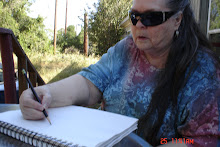
I think that is true. I often reach a point where I have to stop and ask someone else's opinion. Sometimes that is my grandson, who has a good eye. He is extremely observant! We have had several discussions about this picture.
Another option is to just put the work back for a while, and look at it again much later. All kinds of things that could be done will usually show up then. And, if I put something back to work on later, I may never get back to it. I find it best to try to finish something all at once. Besides just losing the work, I also lose that original feeling that is so important. I'm not disciplined enough, I guess, to be able to work on something for a little while, then do something else, and come back later and continue. I can always tell where I left off. Everything changes.
Sometimes, I just stop because I am tired of looking at the work, and it looks like it needs so much work still, and, at that point, I'm often ready to just throw it away. It takes a lot of self talk to convince myself to put it back for a while and not put it in the trash can. I'm much better at saving things than I used to be.
I am tempted to stop on this one, but I still think the sky could use some more layering and blending.
*****************************
The first Prismacolor drawings that I ever saw, were on display at the University of Texas in Austin. They were quite large, and were just amazing. I had taken students there on a field trip, and we fell in love with Prismacolors. We just had to get some and learn how to use them. Those original drawings had around 32 layers of color on them. I remind myself of that when I am tempted to stop with only 8 or so layers of color.
**************************
I do like to draw "girls" and drapery in material. And I love to play around with makeup and hairstyles. As a student, I would do that instead of my classwork, and try to hide my papers so the teachers wouldn't catch me. I think that they all knew that I was drawing instead of doing my work!
*******************
This picture is of a beautiful, elegant, amazing woman, surrounded by her people-the people she loves. It is a clear, beautiful day, to match the beauty that she exhibits. There have been such women in history. We can use many more dedicated, intelligent, strong, beautiful, and loving women who will make this world a better place for us all.
**********************************
Thank you for reading, and for your support. I hope that you enjoy my work.
***************************************
Be sure to read my previous post on The Vision Test and Macular Degeneration. Other art work and experiences on the subject can be found in the Archives and are prefaced with the word "Vision". Also there are links in the side bar under Eye Sites.
******************************************
Virginia Vaughan is having workshops and also shows of her paintings on the subject of "The Last Year On The Farm". Her book of that title will also be coming out very soon. Check out her website and her blog for more information. There is a link in my sidebar.
*********************************************
Russell Baker posted another touching painting of a rescued dog that didn't make it, on his blog. You can find a link to him in my sidebar also. These are such touching paintings and stories!
********************************************
Laura Brittain's post on "Sandpaper People" was certainly timely for me. You can check out her link on my sidebar, too.
Check out my Guest Book!
Scroll all the way to the bottom of the page.


No comments:
Post a Comment